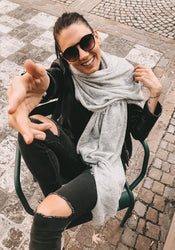


By Carmen, Styling at Princess Goes Hollywood
As a stylist, every day I decide which color makes or breaks an outfit. Not the garment, not the cut, not the material. The color. It's the first thing others see. The first thing that sets a mood. And the first thing you think about when you stand in front of your wardrobe in the morning and don't know what to wear.
That's exactly why I love writing about color. Not as a trend report, but as what it really is: a tool. One that each of us has, and that most people use far too rarely.
Here are the six colors that consistently occupy me on set, and how I would wear them.
Cloud Dancer: the quietest statement with the biggest impact
Pantone has named Cloud Dancer the color of the year, and I immediately understand why. Not because white is new, but because this white is special. Warmer than snow white, softer than ecru, somewhere between cream and the light on a cloudy summer day. It's the color I put on when I know the look should speak for itself.
On set, I reach for Cloud Dancer when everything else has become too loud. It calms, it opens up, it allows other elements to breathe. Worn in linen or muslin, it has that relaxed luxury energy that arises when color and material understand each other.
My styling tip: Wear Cloud Dancer monochromatically, layering different cream and beige tones. Add gold jewelry and natural beige sandals. This is one of the most elegant looks I know, and at the same time, the most effortless.
Marina & Cobalt: for all who miss the sea
Deep, vibrant blue is a color I never tire of. Marina and Cobalt evoke boats, house facades, the sky just before evening. On set, these shades look phenomenal on tanned skin, and I always use them when I want someone to instantly look like summer.
What excites me about Marina and Cobalt: They are surprisingly versatile. With Cloud Dancer, they are the most elegant combination. With camel or cognac, they look more modern, less maritime, more Côte d'Azur. And with tomato red, for those who are truly bold, one of the most surprising color combinations summer has to offer is created.

Butter Yellow & Citrus: the color that gives energy
I tell everyone on set: once you've tried yellow, you won't want anything else. Butter yellow is the softer choice, almost neutral, almost a basic shade, but with that warm shimmer that enlivens every look. Citrus is bolder, more direct, unapologetic. Both remind me of the Amalfi Coast, of lemons on house walls, the late afternoon light, the feeling of endless vacation.
For the simplest yellow look: white trousers, white top, a citrus bag and matching earrings. That's all. The rest happens by itself.
Tomato Red & Lava Falls: the color for the day you want to be seen
Tomato red and its warmer brother Lava Falls are the colors I put on when I know: today it has to be a statement. They look stunning on tanned skin, and I've never had bad pictures with red on any shoot. Not a single one.
The strongest thing you can do with red: wear it alone. Head to toe, with Cloud Dancer as the only contrast. Gold jewelry, simple sandals. The red does the rest. For those who prefer to work with accents: a red bag, a red belt, red earrings with a neutral look. That's also enough to transform a room.

Pink & Blush: not sweet, but strong
Pink is one of the most misunderstood colors. Many wear it too delicately, too demurely, as if they want to apologize. That's wrong. Pink is most beautiful when worn confidently. With attitude. With the knowledge that it works.
On set, I love combining pink with gold jewelry for that warm, luxurious tone. Or with tomato red, which always surprises me with how good it looks. Two colors you don't expect together that create something extraordinary.
Chocolate & Earth Tones: the underestimated luxury palette
Chocolate brown, macchiato, terracotta, warm sand: these are the colors I always return to when I'm looking for something that looks both relaxed and elegant. On tanned skin, earth tones look tailor-made. In linen or muslin, chocolate brown loses any heaviness.
My favorite earth tone look: different shades of brown and sand layered, stacked monochromatically. With gold and cognac-colored leather. Or chocolate with Cloud Dancer, one of my favorite contrasts of all time. Warm against soft, grounded against floating.
Which color is yours?
What I've learned after years on set: color is not about courage. Color is about knowledge. If you know which shade suits your skin, what energy you want to radiate, and how a color works in the right material, you no longer need courage. Just the right decision.
If you don't know yet which summer color is yours: start with an accessory. A silk scarf in Marina, earrings in tomato red, a bag in Citrus. With a neutral outfit, with an existing look. That's how the boldest things sometimes begin.
You can find our summer pieces in the most beautiful seasonal colors in the Bella Italia Collection and the Dolce Vita Collection.